In this tutorial, you’ll learn how to add, customize, and use buttons effectively within your page builder. Buttons can be styled, linked, animated, and configured for multiple purposes such as navigation, triggering pop-ups, or submitting forms.
Step-by-Step Guide
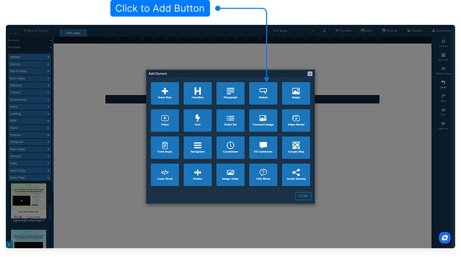
Add a Button to Your Page
From the left-hand side menu, drag a Button element into your desired column or section until you see the yellow placement bar.
Release the mouse button to place the button.
Open the Button Settings
There are three ways to access the button settings (inspector):
Left-click anywhere on the button (outside the text area).
Right-click the button and choose Edit.
Click the Edit icon in the toolbar.
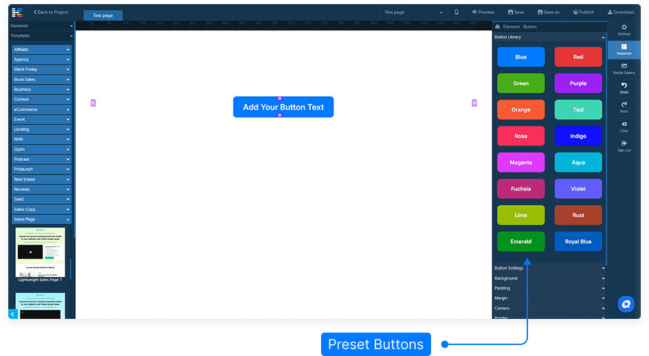
Apply Button Presets
Use the Preset Buttons section to quickly change the button’s color scheme.
Click a preset to instantly apply it to your button.
Customize Button Settings
Line Height: Adjusts the vertical spacing of the text inside the button.
Button Type:
Fixed: Define a specific width (in % or pixels). Default is 50%.
Fluid: Button width automatically adjusts based on the text length.
Button Name: Useful if you plan to target the button with custom CSS or JavaScript.
Add and Customize an Icon
Choose an icon to display before or after the button text.
Adjust the icon size, color, and hover color.
Set separate icon sizes for desktop and mobile views.
Add Subtext Below the Button
Enable subtext to display additional text beneath the main button text.
Adjust spacing between the main text and subtext.
Set hover color and mobile display settings for the subtext.
Configure the Button Link
Link Type:
URL: Enter an external link (e.g.,
https://yourwebsite.com).Set the Target to:
_blank – opens in a new tab
_self – opens in the same tab
In-Page Navigation: Link the button to an internal section. Example: if your section is named “bottom-section,” select that as the target to scroll down when clicked.
Pop-up Trigger: Set the button to open a pop-up previously configured in your settings.
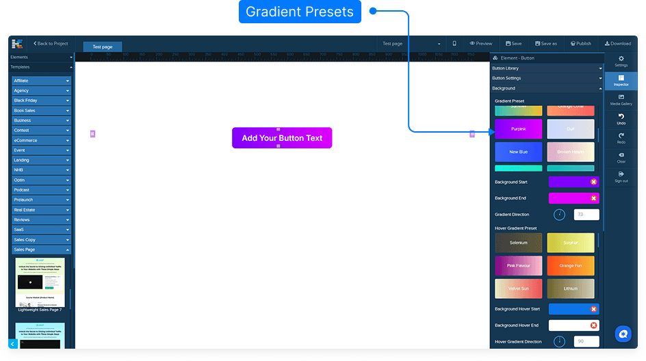
Customize Background and Style
Choose a background color, gradient, or image.
Adjust image position, size, and repeat behavior.
Set overlay effects with color opacity for layered designs.
Add padding, margins, and borders as needed.
Round the corners or add shadows for visual depth.
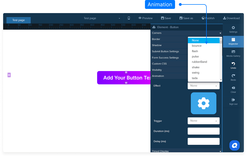
Enhance Button Appearance with Animations
Apply entrance, scroll, or hover animations from the Animations menu.
Set the duration and delay for the animation effect.
Example: A “flash” animation on hover draws user attention.
Adjust Visibility and Timing
Control where the button appears:
Desktop & Mobile
Desktop Only
Mobile Only
Use Time Display settings to define when the button appears or disappears on the page (advanced feature).
Edit Button Text
Click directly on the button text to open the text editor.
Edit or replace the text, change its color, font, size, or make it bold/italic/underlined.
All standard text formatting options are available.
Submit Button Settings (For Forms)
If the button is part of a form, enable Submit Button mode.
This will override the URL link settings and make the button submit the form data.
Configure integrations or storage options for your form submissions as needed.
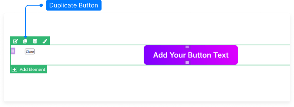
Clone or Duplicate Buttons
To duplicate a button, hold down the Ctrl key (or Cmd on Mac) and drag the button to a new position.
This creates an exact copy that you can edit separately.
Save Your Page
Always click Save after making changes to ensure your edits are preserved.
And that’s it! You’ve now learned how to fully customize and configure buttons — from styling and animations to linking and form submissions — giving you full creative control over your design.