This tutorial will guide you through the process of adding and customizing a pop-up element on your page. Pop-ups can be used to display images, offers, or messages when a visitor performs specific actions, such as loading or exiting the page.
Step 1: Enable Pop-ups on Your Page
Open your page in the editor.
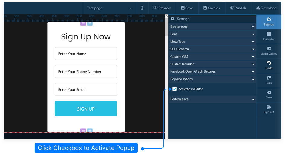
Go to the Settings menu located at the top-right corner of the editor.
Under Pop-up Options, select Activate in Editor.
This will create a pop-up section on your page where you can place and edit your pop-up content.
Step 2: Add Content to Your Pop-up
Decide which element you want to display in your pop-up. This could be an image, video, form, or text block.
For this example, we’ll use an image.
Click on the pop-up area to add an image element.
Hover over the image block, then select Edit from the green menu to open the inspector.
Click Browse Image to upload or choose an image from your media library.
Step 3: Access and Edit Pop-up Settings
Go to the top-left corner of the editor and click the Edit icon for the pop-up section.
This will open the inspector panel with all available customization options.
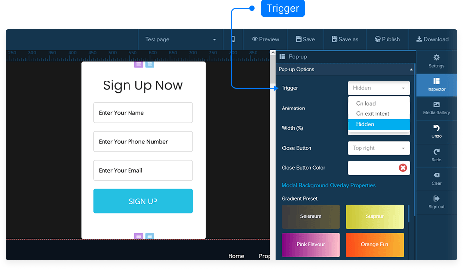
Step 4: Choose a Pop-up Trigger
Decide when your pop-up will appear using the Trigger Options:
On Load: The pop-up appears as soon as the page loads.
On Exit Intent: The pop-up displays when a visitor moves their mouse upward to leave the page.
Hidden: The pop-up remains hidden until triggered manually.
Step 5: Customize Animation and Appearance
Choose how your pop-up appears visually and behaves on screen:
Animation Type: Choose from:
Default
Bounce
Flash
Pulse
Rubber Band
Shake
Width: Set the width of your pop-up as a percentage of the screen width.
Close Button:
Position: Top Left, Top Right, Bottom Left, or Bottom Right
Color: Choose your desired color for the close button
Step 6: Set Display Timing
Delay Time: Choose how many seconds after page load the pop-up should appear. Set to 0 for instant display.
Repeat Delay: Decide how often the pop-up should reappear for the same visitor:
0: Shows every time they visit the page.
1: Shows again one day later.
Or set any other number for days of delay.
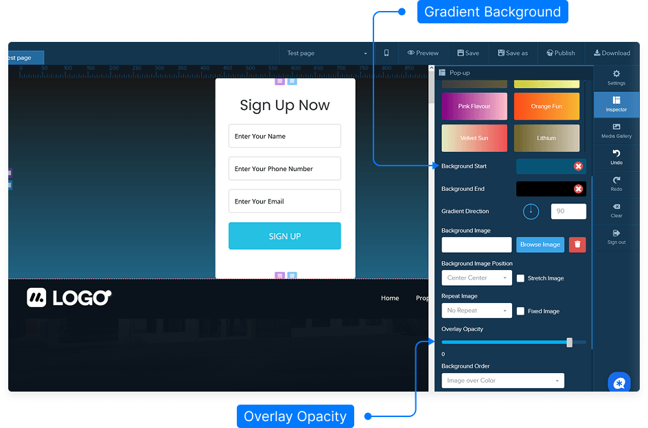
Step 7: Design the Background
Background Type: Choose between a solid color or gradient.
Gradient Direction: Adjust the angle of the gradient if selected.
Background Image:
Upload or choose an image from your media gallery.
Adjust positioning: Left, Center, Right, Top, or Bottom.
Choose image behavior: Repeat, Stretch, or Fixed.
Adjust opacity using the slider.
Step 8: Adjust Layout and Style
Padding: Add space inside the pop-up content area.
Rounded Corners: Set corner radius. Use 0 for sharp corners, increase for rounded ones.
Border: Add and customize a border if desired.
Shadow: Add shadow effects with adjustable color, spread, and intensity.
Custom CSS: Apply additional styling through your own CSS code.
Step 9: Preview Your Pop-up
Click Preview to see how your pop-up will look on the live page.
Observe the animation and transparency effects.
Click anywhere outside or use the close button to dismiss the pop-up.
Step 10: Save Your Page
When satisfied with your settings, click Save to ensure all your pop-up configurations are stored.
That’s it! You’ve successfully customized a pop-up element on your page, complete with animations, triggers, and background styling.