This quick tutorial will show you how to preview your page as it would appear on a mobile device.
Steps to View Mobile Preview
Open your page in the editor.
Locate the Mobile Preview button on the top toolbar.
Click the button once — your page will switch to a mobile view mode.
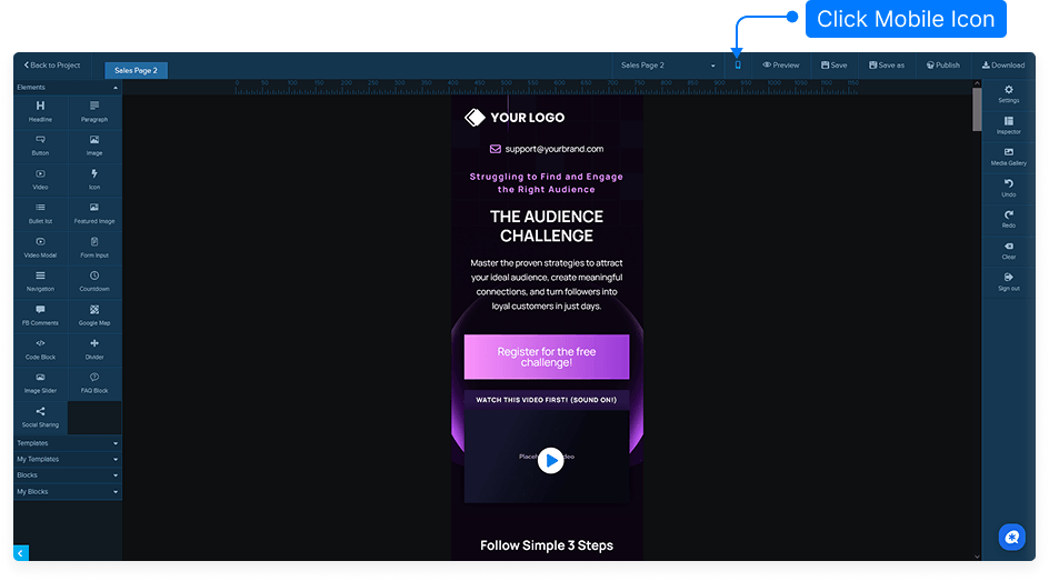
Review how your design appears on a mobile screen to ensure proper layout and readability.
Click the button again to return to the standard desktop view.
That’s it! You can easily switch between desktop and mobile views to make sure your page looks great on all devices.